Rachel Laskowski

Customer Identification Design

A Usability Research Study

What Research Challenge was I Asked to Solve?

Based on the previous customer behavior observations and interviews, the project team designed a most viable product (MVP) that would allow customers to do an advanced check-in or complete it when they arrived at a branch. The concept proceeded as an app feature to make the check-in available through customers’ devices and to include the ability to choose a reason for the branch visit.

 However, the MVP would not be able to provide customers benefits, such as feedback to help them know when the branch is less busy or help them save time in some other way, such as a skip-the-line station. Nor would the MVP be able to communicate back to the customer which colleague they needed to see upon arrival.

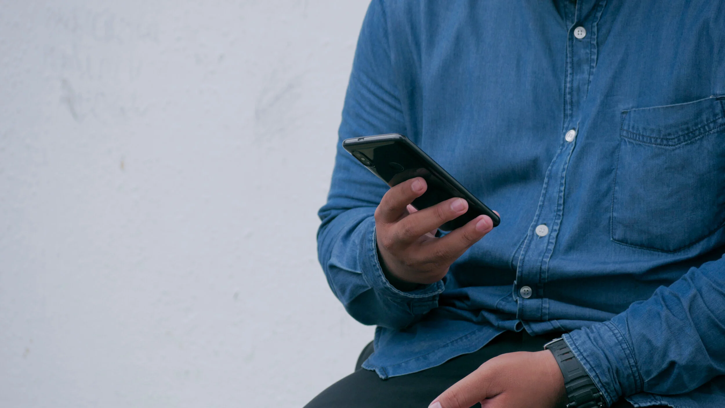
I was asked to conduct usability testing on high-fidelity prototype flows to ensure customers could complete the digital check-in process, and identify any usability or content issues.

To comply with my non-disclosure agreement, I have omitted and obscured confidential information in this case study.

tablegroupthree.jpg

Actions

What was My Plan to Address This?

Since we would be meeting with customers to uncover any usability or content issues, I also planned to continue exploring customers’ expectations based on prior check-in experiences. I wanted to verify further what their expectations would be of the check-in experience we would be presenting at that time. Even though previous research revealed customer expectations of a check-in experience, I felt it would be beneficial to the project team and stakeholders to observe sessions and hear first-hand from customers.

Problem Statement

  • When a customer visits a branch, it can be time-consuming and inefficient for colleagues to find an exact customer match when using search tools.

  • This causes a delay in service and diverts colleague’s attention away from the customer, resulting in decreased throughput and less opportunity for teller referrals.

  • How might we entice customers to use their own device to check-in, so that our colleagues can focus less on searching for customers and more on having meaningful interactions with them?

Research Objectives

  • To understand customers’ current expectations based on experiences with check-in processes outside the financial industry.

  • To further learn what expectations customers have in regards to a branch check-in process.

  • To uncover any issues with usability, messaging, or content, especially any that would hinder customers' ability to complete a digital check-in process.

I’m checked in to make a deposit or something like that until 7:00 pm. I guess that means I can check-in and have a window of whatever, but you’re not getting any… it just says to take your spot at the end of the line. So, I wouldn’t necessarily check-in to go to the bank to make a deposit and still stand in line. It’s kind of pointless. There’s no value.
— Participant 2

Research Methods & Participants

Twelve (12) 90-minute, in-person moderated usability sessions were held with bank customers over a three (3) day period. Fifteen (15) bank customers who use the mobile app and conduct banking in a branch, were recruited through the lab facilities company, with screener criteria and questions provided for them.


About the Study

To get participants in the frame of mind of the study's topic, we began by asking them questions about any previous encounters with check-in experiences - either within or outside of the financial industry.

Following that initial conversation, we alternated between scenarios, introducing half the customers to the mobile app's new check-in feature by showing a physical poster and presenting the other half the mobile flow that displayed a check-in feature notice on the landing page.


Check-in Poster

Check-in Notice on app landing


Stakeholders were interested in getting an idea of which form of communication might be most effective for customers to learn about the new functionality, taking into account we would be in a lab setting and not a branch environment.


  • Flow 1 was shown to customers that were first presented with the check-in poster

  • Flow 2 is where customers began who were presented with only the landing page check-in messaging

  • Flow 3 all customers were given the scenario that they were returning to the branch a couple of weeks later and did not have the benefit of a sign or an ad on the app’s landing page – where would they begin?


To complete the usability portion of the session, customers stepped through tasks using a digital mobile prototype to uncover any usability, way finding, or content issues. Mainly anything that would hinder customers' ability to complete the digital check-in process as designed.

Finally, we wrapped up discussions with questions eliciting what customers would expect from the rest of their branch experience following these check-in steps.

Findings & Recommendations

Flow, Usability, and Content

Overall, customers presumed the app would detect their location and change their experience based on whether they were in the branch or remote. The number two (2) flow was preferred over the others because customers anticipate logging in first before interacting with the app functionality. Customers only see value in this check-in process if it helps them understand when to arrive to avoid waiting and, instead, make the most of their time.


Expectations

  • Above all, customers felt a check-in should save the customer time

  • Customers don’t expect to wait if they’ve done an advanced check-in

  • They expect to go into a queue where colleagues can quickly and easily pull-up their profiles

  • Customers expect colleagues to have some knowledge of who they are and what they are in the branch to do

  • Check-in makes sense to most customers when they want to see a banker, but not for teller services

  • And for an advanced check-in they expect a way to let colleagues know when they’ve arrived

sky_blue.gif

Results

What were the Results of the Work?

Overall, the Check-in MVP fell short of customer expectations and acceptance. Because the research was conclusive and the strength of hearing customers' voices first-hand, the business made the difficult decision to take a step back and think of other possible solutions to address the work-stream's problem statement.

The positive aspect was that the project team, management, and stakeholders did not push forward with the check-in concept as it was designed. The development of this project was estimated to cost 500-700K. For a 10K research effort, the bank saved at least 500K. The research was able to show that customers maybe would have tried the feature once, but would not have continued to use it to experience subsequent enhancements and the budget was reallocated for other initiatives.    


Lessons Learned

What did this project teach me about research, design, or myself?

This project reconfirmed the power of business colleagues witnessing first-hand customer feedback. Going forward, I will need to incorporate video when reporting back to the teams or think of ways to get remote access for stakeholders and project members to watch or at least listen to direct customer feedback whenever possible. I can deliver the same customer message over and over again and still not make progress, or I can find better ways to allow the customers' collective voice to be heard directly.